8 Room Color Ideas to Set the Perfect Mood in Every Space
A 2019 study published in the journal Frontiers in Psychology found that color influences human emotion within 90 seconds of first exposure, and up to 90% of a snap judgment about a product or environment is based on color alone. That finding does not just apply to marketing. It applies to every wall in your home. If you have ever walked into a room and felt inexplicably anxious, restless, or deeply at ease, the paint color had more to do with that feeling than almost anything else in the space.
Disclosure: This post contains affiliate links. As an Amazon Associate, we earn from qualifying purchases, and at no extra cost to you.
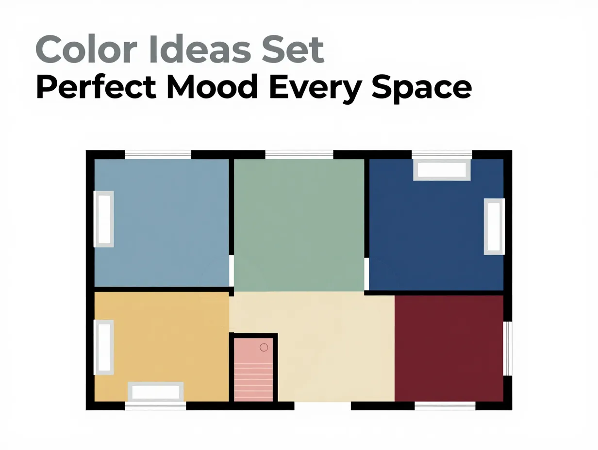
This guide covers 8 room color ideas to set the perfect mood in every space, from the bedroom where you unwind to the dining room where you gather with people you love. Each idea is grounded in color psychology, backed by design expertise, and practical enough to apply whether you are repainting an entire home or just one accent wall.
Key Takeaways
- Color directly shapes how you feel in a room, choosing intentionally can reduce stress, boost focus, or spark appetite.
- Different rooms call for different psychological goals, so a one-size-fits-all palette rarely works.
- Soft blues and earthy greens are among the most versatile mood-setting colors for relaxation and balance.
- Bold colors like red and black work best in moderation, used as accents rather than dominant tones.
- Neutral and transitional spaces, like entryways, benefit most from calming, welcoming shades that ease the shift from outside to inside.
Why Color Psychology Matters More Than Trend
Before diving into the 8 room color ideas to set the perfect mood in every space, it helps to understand why color psychology is worth taking seriously, and not just following whatever shade is trending on social media this season.
Color psychology is the study of how hues affect human behavior and emotion. It is not pseudoscience. Researchers, architects, and healthcare designers have used it for decades to shape environments that promote healing, productivity, and calm. Hospitals use specific greens and blues to reduce patient anxiety. Schools experiment with yellow and orange to stimulate alertness. Retailers use red to drive urgency.
Your home deserves the same intentional thinking.
The challenge is that most homeowners choose paint colors based on what looks good on a swatch, not on how that color will feel at 7 a.m. on a Tuesday or at 10 p.m. after a long day. The two experiences are very different.
“The right color in the right room does not just look beautiful, it actively changes how you feel in that space every single day.”
When I repainted my home office from a warm beige to a deep slate blue two years ago, the shift in how I worked was immediate and measurable. I was more focused, less distracted, and found it easier to stay at my desk for longer stretches. That experience sent me down a research rabbit hole that eventually led to this article.
Here is what the evidence and design experts actually recommend.
8 Room Color Ideas to Set the Perfect Mood in Every Space
1. Serene Blues for the Bedroom
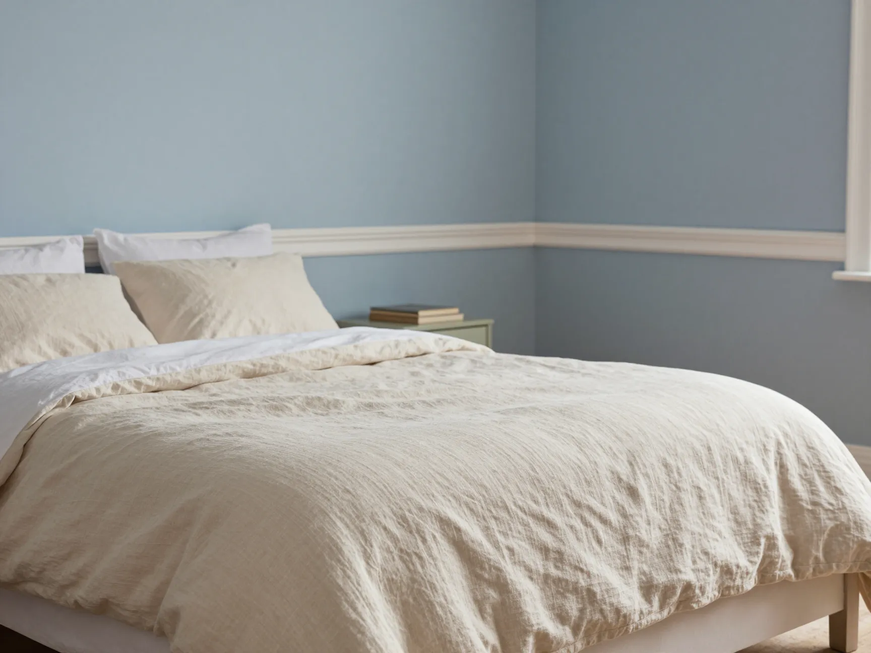
The bedroom is the one room in your home that has a single, non-negotiable job: help you rest. Soft, muted blues are consistently ranked as the most effective colors for promoting relaxation and sleep quality.
Blue tones lower heart rate and reduce cortisol, the stress hormone. Shades like dusty blue, powder blue, and the designer-favorite Farrow & Ball Parma Gray create an atmosphere of calm that signals to your nervous system that it is time to wind down [1].
Best shades to try:
- Parma Gray by Farrow & Ball
- Borrowed Light by Farrow & Ball
- Quiet Moments by Benjamin Moore
- Whispering Blue by Sherwin-Williams
What to avoid: Avoid saturated, electric blues. They read as energizing rather than calming and can have the opposite effect of what you want in a sleep space.
Pro tip: Pair soft blue walls with warm white trim and natural linen bedding. The contrast keeps the room from feeling cold while preserving the calming quality of the blue.
2. Energizing Yellows for the Kitchen
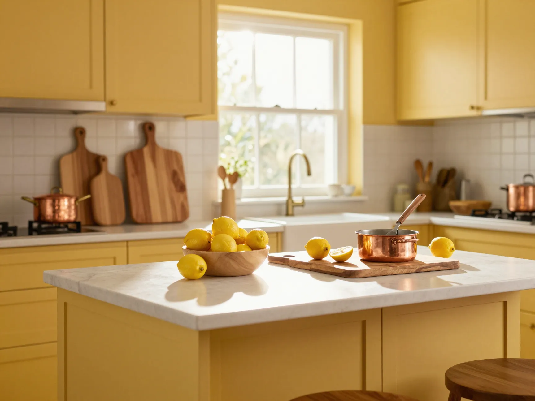
The kitchen is where mornings begin, meals are made, and families often gather without planning to. It is a high-energy, high-activity space, and the color you choose should match that rhythm.
Warm yellows, think buttery gold, soft saffron, or rich marigold, have been shown to stimulate mental activity and create a sense of warmth and welcome. Designers note that rich yellow tones are particularly effective in kitchens with limited natural light because they mimic the warmth of sunlight even on grey days [2].
Yellow also has an appetite-stimulating effect, which makes it a smart choice for any space where food is central.
Best shades to try:
- Hawkweed by Farrow & Ball
- Sunburst by Behr
- Jonquil by Benjamin Moore
- Butter by Sherwin-Williams
What to avoid: Neon or acidic yellows can become visually fatiguing over time. Stick to warm, earthy undertones rather than cool, greenish-yellow hues.
A practical note: Yellow reflects light strongly, so test your chosen shade at different times of day before committing. A shade that looks golden at noon can look almost orange by evening under incandescent light.
3. Grounding Greens for the Living Room
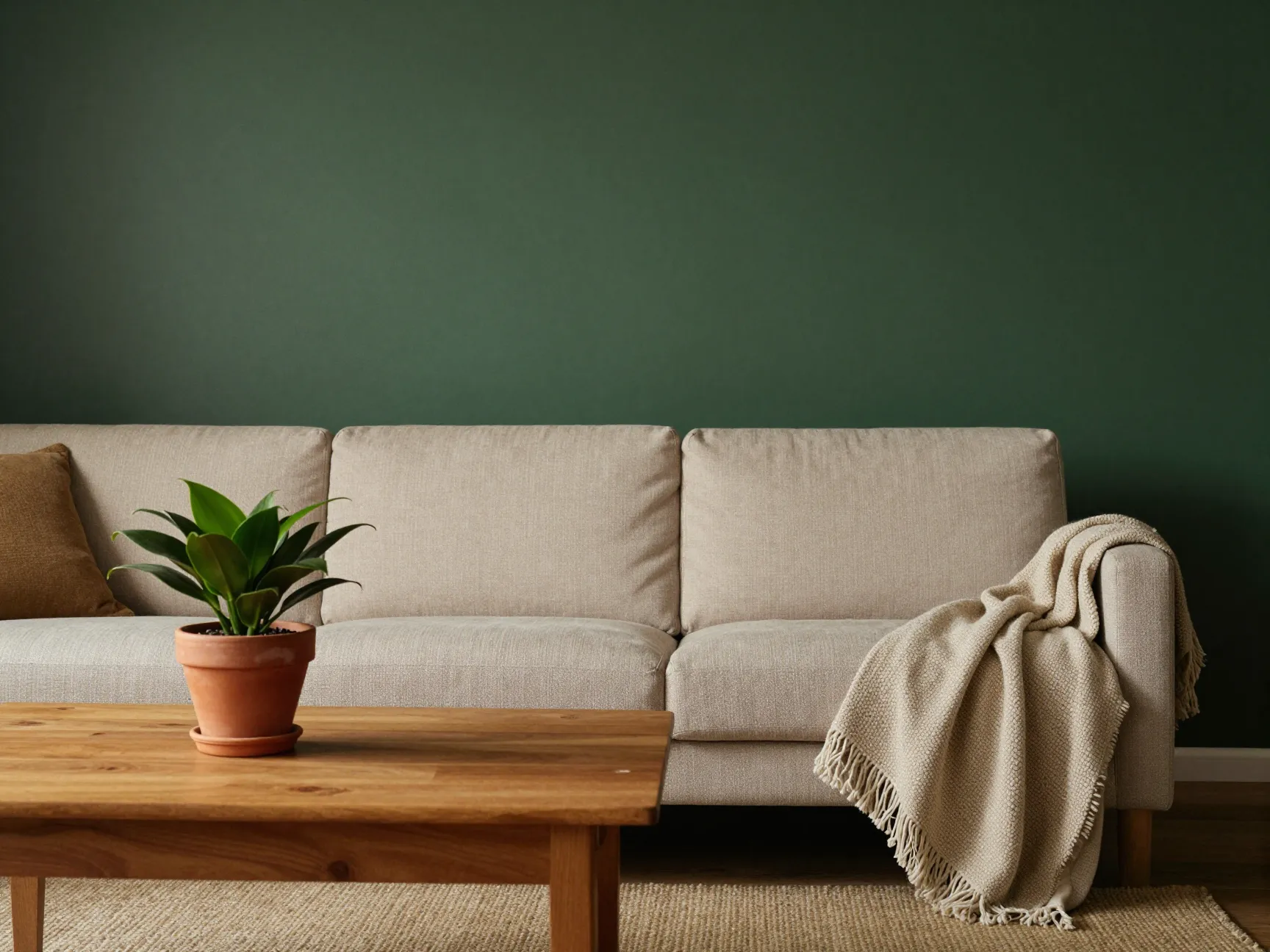
The living room is where your household transitions between activities, from work to rest, from solo time to social time. It needs a color that can hold multiple moods without feeling jarring.
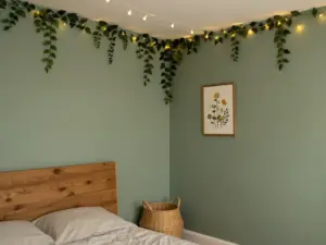
Earthy greens, particularly sage, deep olive, and forest green, deliver exactly that kind of versatility. Green is the color most associated with nature, balance, and harmony. It is easy on the eyes because the human visual system requires no adjustment to process it, the lens of the eye focuses green light almost perfectly on the retina.
Interior designers consistently recommend greens for living rooms because they create a cozy, grounded atmosphere without the heaviness of darker neutrals [3].
Best shades to try:
- Mizzle by Farrow & Ball
- Sage by Benjamin Moore
- Rosemary by Sherwin-Williams
- Crocodile by Farrow & Ball
What to avoid: Avoid yellowy-greens in spaces with warm artificial lighting, they can shift toward an unflattering olive under incandescent bulbs.
Design tip: Deep olive or forest green works especially well on a single feature wall behind a sofa, paired with warm wood tones and terracotta accents for a layered, expensive-looking result.
4. Productive Blues for the Home Office
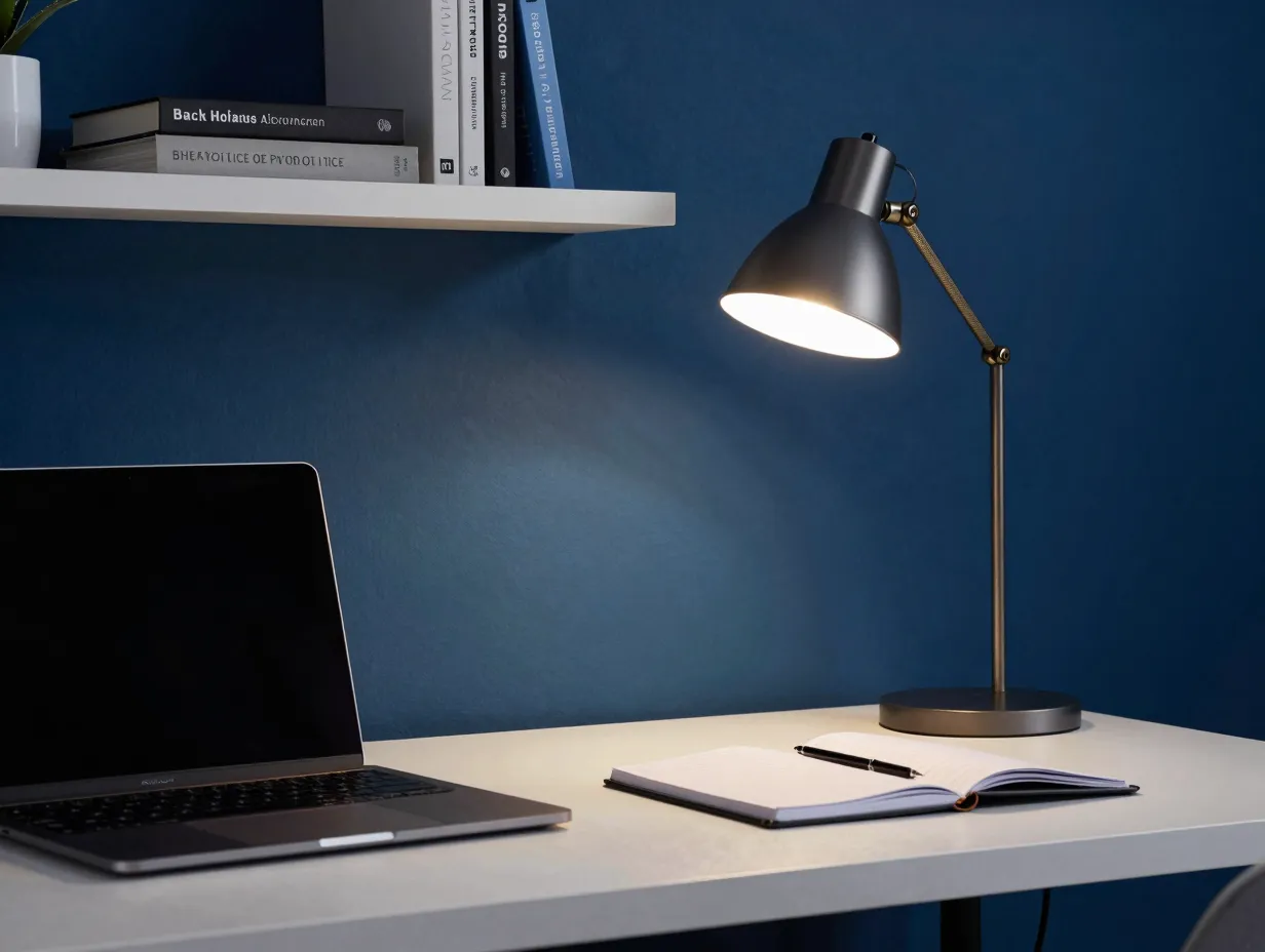
Not all blues are created equal. While soft blues calm the bedroom, deeper and more saturated blues do something different in a work environment: they sharpen focus and support mental discipline.
Research into workplace color psychology has found that darker blues enhance concentration and analytical thinking, while lighter blues foster creativity and open-ended problem-solving [4]. This makes the home office one of the most interesting rooms to color because the right shade depends on the kind of work you do.
Best shades to try:
- Hague Blue by Farrow & Ball (for deep focus work)
- Stiffkey Blue by Farrow & Ball (for creative work)
- Naval by Sherwin-Williams
- Van Deusen Blue by Benjamin Moore
What to avoid: Avoid very dark, near-black blues in small offices without natural light. They can make the space feel oppressive rather than focused.
| Work Type | Recommended Blue | Tone |
|---|---|---|
| Deep analytical / finance | Hague Blue | Dark, saturated |
| Creative / writing / design | Stiffkey Blue | Mid-tone, cool |
| Teaching / communication | Quiet Moments | Light, airy |
| General productivity | Naval | Deep, grounding |
5. Romantic Pinks for the Bathroom
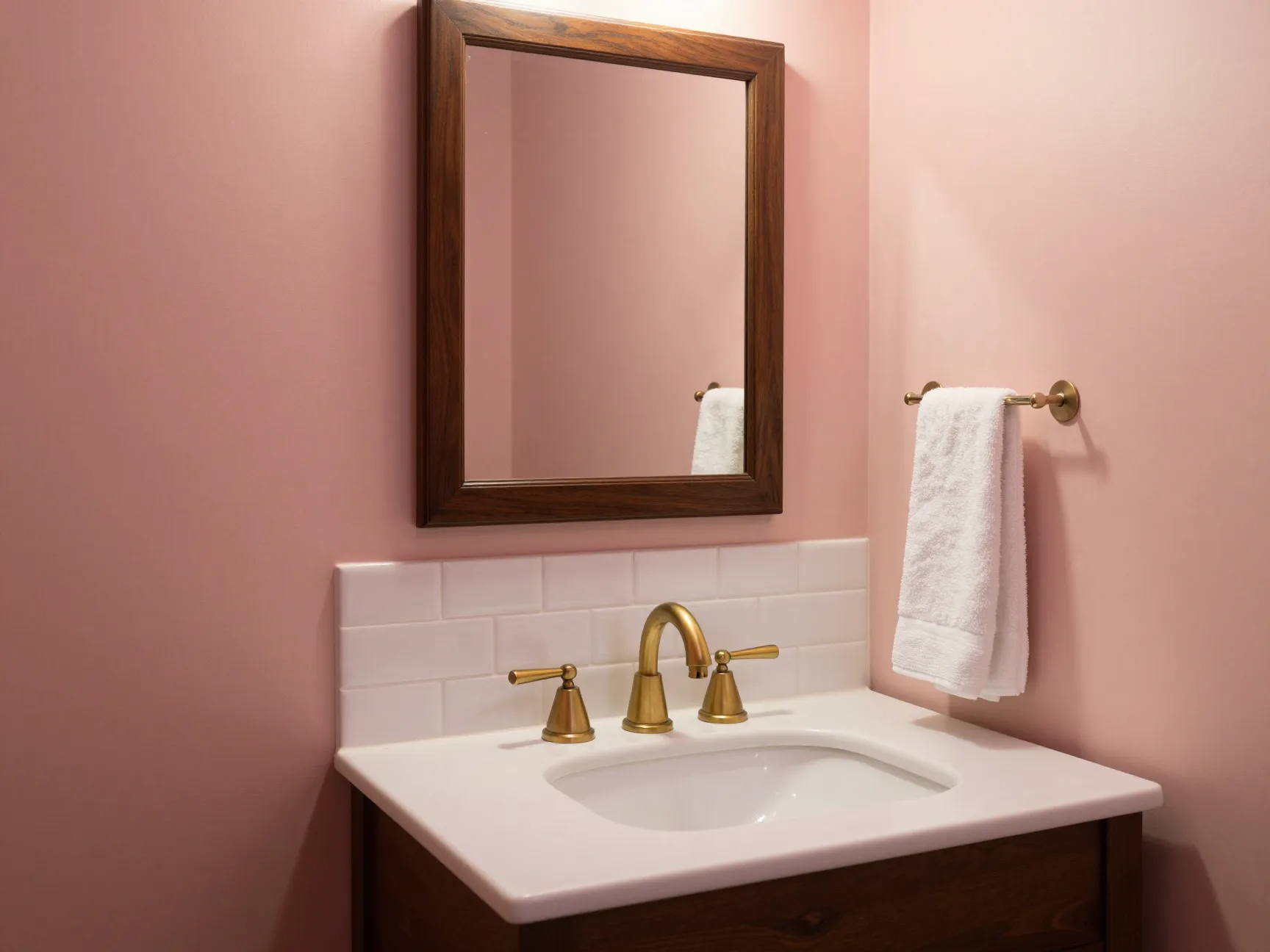
The bathroom is often treated as a purely functional space, but it is also one of the most private rooms in the home, a place for morning rituals, evening wind-downs, and quiet moments alone. Color can transform it from utilitarian to genuinely restorative.
Earthy, peach-toned pinks, sometimes called plaster pink or dusty rose, add warmth and softness without overwhelming a small space. Unlike hot pinks or fuchsias, these muted tones read as sophisticated and calming. They also have a flattering effect on skin tones under warm lighting, which is a practical bonus [2].
Best shades to try:
- Setting Plaster by Farrow & Ball
- Mallow by Farrow & Ball
- Pale Blush by Benjamin Moore
- Antique Rose by Sherwin-Williams
What to avoid: Avoid cool, bubblegum pinks. They can feel juvenile and clash with most bathroom fixtures.
Styling tip: Plaster pink paired with unlacquered brass fixtures, white subway tile, and dark wood accents creates a bathroom that feels both warm and elevated, a combination that photographs beautifully and feels even better in person.
6. Sophisticated Blacks for Accent Details
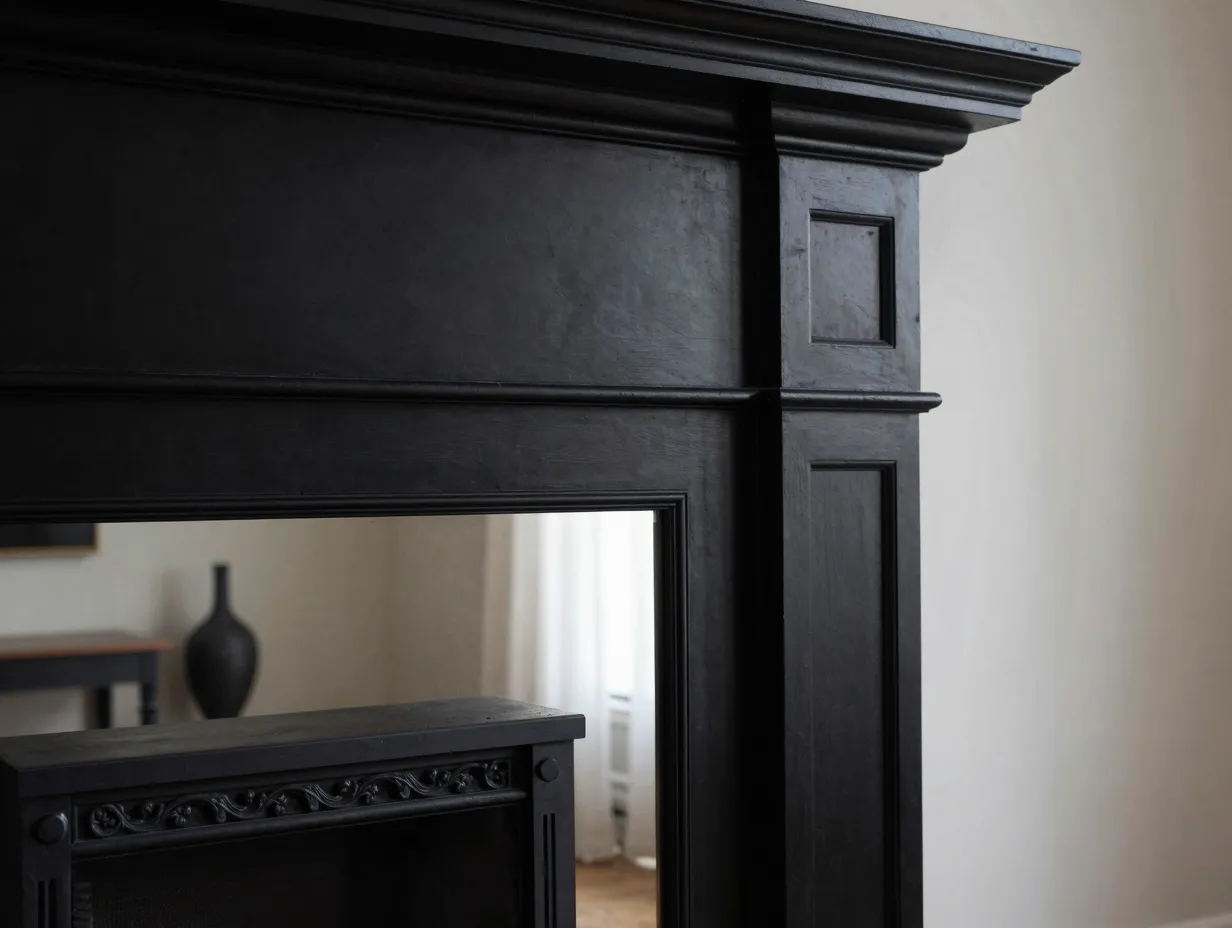
Black is not a color most homeowners think of as mood-setting in a positive sense. Used carelessly, it can make a room feel heavy, cold, or claustrophobic. But used with intention, as an accent rather than a dominant tone, black adds a layer of elegance and visual depth that no other color can replicate [5].
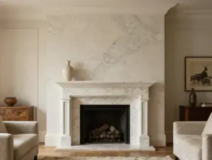
Think black window frames, a black-painted fireplace surround, black cabinet hardware, or a single black accent wall in a room with abundant natural light. These applications ground the space and give the eye a place to rest.
Best applications for black accents:
- Window and door frames
- Kitchen island or lower cabinetry
- Fireplace surrounds
- Ceiling beams or trim
- Statement furniture pieces
What to avoid: Avoid painting all four walls of a small, poorly lit room black. The result is almost always oppressive rather than dramatic.
Design insight: Black works best when it is used as a framing device. It draws attention to architectural features, makes other colors pop, and gives a room a finished, intentional quality that is hard to achieve with softer tones alone.
7. Calming Neutrals for the Entryway
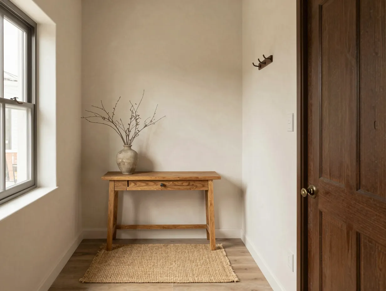
The entryway is the first thing you see when you come home and the last thing you see before you leave. Its color sets the emotional tone for everything that follows. A jarring or overly stimulating entryway color creates a subtle but real sense of unease every time you cross the threshold.
Soft, warm neutrals, think creamy whites, warm taupes, and delicate terracotta-tinged beiges, create a welcoming, transitional atmosphere that eases the shift between the outside world and your home. Designers specifically recommend shades like Atelier Ellis’ Cotta for their ability to feel warm and grounding without being heavy [2].
Best shades to try:
- Cotta by Atelier Ellis
- Elephant’s Breath by Farrow & Ball
- Accessible Beige by Sherwin-Williams
- White Dove by Benjamin Moore
What to avoid: Avoid stark, cool whites in entryways. They can feel clinical and unwelcoming, particularly in homes with north-facing front doors that receive little natural light.
Practical consideration: Entryways are high-traffic areas. Choose a paint finish with at least a satin or eggshell sheen so the walls can be wiped down without losing their color.
8. Stimulating Reds for the Dining Room
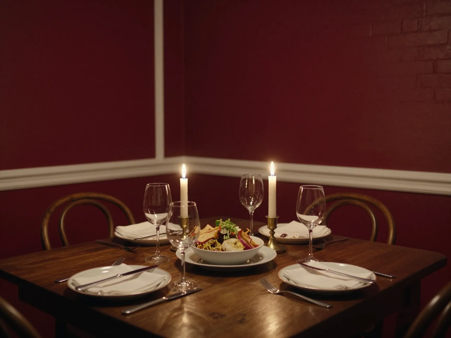
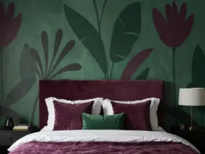
Red is the most psychologically powerful color in the spectrum. It raises heart rate, stimulates appetite, and encourages conversation, all of which make it a compelling choice for the dining room, where the goal is connection, energy, and enjoyment of food [5].
The key with red is restraint. A full room of saturated red can feel overwhelming and even aggressive. The most effective approach is to use red on one or two walls, or to choose a deeper, more complex red, burgundy, terracotta, or brick red, that carries the energy of the color without the visual intensity of a pure, primary red.
Best shades to try:
- Rectory Red by Farrow & Ball
- Radicchio by Farrow & Ball
- Caliente by Benjamin Moore
- Antique Red by Sherwin-Williams
What to avoid: Avoid bright, fire-engine reds in small dining rooms. The effect is more anxiety-inducing than appetite-stimulating.
Pairing tip: Deep red walls pair beautifully with warm white or cream trim, dark wood furniture, and candlelight. The combination creates a dining experience that feels genuinely special, the kind of room that makes a Tuesday dinner feel like an occasion.
How to Choose the Right Color for Your Space
Understanding the 8 room color ideas to set the perfect mood in every space is one thing. Knowing how to apply them to your specific home is another. Here are the most important factors to consider before you buy a single can of paint.
Natural light: The direction your windows face dramatically affects how a color reads. North-facing rooms receive cool, indirect light that can make warm colors look muted and cool colors look cold. South-facing rooms receive warm, bright light that makes almost any color look better. Always test paint samples in the actual room, at multiple times of day, before committing.
Room size: Dark colors make rooms feel smaller and more intimate. Light colors make rooms feel larger and more open. Neither effect is inherently good or bad, it depends on what you want the room to feel like.
Existing fixed elements: Your flooring, cabinetry, countertops, and permanent fixtures are not changing. Your paint color needs to work with them, not fight against them. Pull undertones from your fixed elements and choose a wall color that complements rather than clashes.
Finish matters: Flat finishes absorb light and hide imperfections but are harder to clean. Satin and eggshell finishes reflect a small amount of light and are more durable. Semi-gloss and gloss finishes are highly reflective and best reserved for trim and cabinetry.
Test before you commit: Always paint a large swatch, at least 12 by 12 inches, directly on the wall and live with it for 48 hours before making a final decision. Colors look dramatically different on a small chip than they do on a full wall.
Common Color Mistakes to Avoid
Even with the best intentions, homeowners make predictable errors when choosing room colors. Here are the most common ones, and how to sidestep them.
Choosing color from a chip under store lighting. Store lighting is almost always fluorescent and bears no resemblance to the light in your home. Always take chips home before deciding.
Ignoring undertones. Every paint color has an undertone, a subtle secondary hue that becomes visible against other colors in the room. A “gray” with a purple undertone will look lavender next to warm wood floors. Always check undertones against your fixed elements.
Painting every room a different bold color. This creates visual chaos when you look from room to room. Choose a cohesive palette of two or three base colors and use them consistently across connected spaces.
Going too light to be safe. Many homeowners default to the lightest version of a color to avoid commitment. The result is often a washed-out, characterless room. Trust the deeper shade, it almost always looks better on the wall than it does on the chip.
Forgetting the ceiling. The ceiling is the fifth wall. Painting it a slightly lighter version of your wall color creates a beautifully enveloping effect. Leaving it stark white when your walls are a warm, saturated tone can create a jarring disconnect.
Conclusion
Color is one of the most powerful and most underestimated tools in interior design. The 8 room color ideas to set the perfect mood in every space covered in this guide, from serene blues in the bedroom to stimulating reds in the dining room, are not arbitrary aesthetic choices. Each one is rooted in how color affects human emotion, behavior, and physical response.
The good news is that you do not need to repaint your entire home to feel the difference. Start with one room. Choose the space where the current color feels most misaligned with how you want to feel there. Apply the principles from this guide, test your chosen shade properly, and give yourself time to adjust.
Actionable next steps:
- Walk through each room in your home and write down one word describing how you want to feel in that space.
- Match that emotional goal to the color psychology principles in this guide.
- Order paint samples, at least three shades in your chosen color family, and test them on large swatches directly on the wall.
- Observe the swatches at morning, midday, and evening before making a final decision.
- Start with one room, complete it fully, and then move to the next.
The right color in the right room does not just change how the space looks. It changes how you live in it.
References
[1] Bedroom Color Psychology – https://www.livingetc.com/advice/bedroom-color-psychology?utm_source=openai
[2] Best Colors For Color Drenching According To Designers – https://www.livingetc.com/advice/best-colors-for-color-drenching-according-to-designers?utm_source=openai
[3] Colors That Make A House Look Expensive – https://www.homesandgardens.com/interior-design/colors-that-make-a-house-look-expensive?utm_source=openai
[4] Home Office Color Psychology – https://www.livingetc.com/advice/home-office-color-psychology?utm_source=openai
[5] Choosing Home Color Schemes – https://www.truevalue.com/diy-projects/paint-and-stain/choosing-home-color-schemes/?utm_source=openai