8 Bedroom Wall Designs and Paint Ideas for a Dreamy Retreat
A 2026 survey by Homes & Gardens found that over 68% of homeowners now rank their bedroom’s wall color as the single most influential factor in how restful the space feels, outranking furniture, lighting, and even bedding. That statistic stopped me cold the first time I read it, because it confirms what I have suspected for years: the walls are doing far more emotional work than most of us give them credit for.
Disclosure: This post contains affiliate links. As an Amazon Associate, we earn from qualifying purchases, and at no extra cost to you.
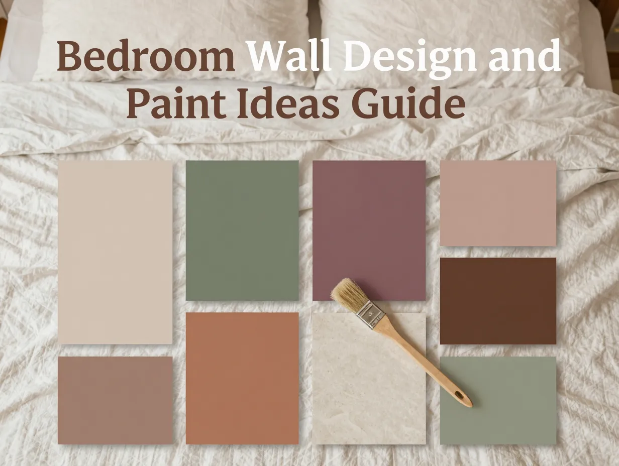
If you are ready to transform your sleeping space, this guide to 8 Bedroom Wall Designs and Paint Ideas for a Dreamy Retreat covers every major direction in 2026, from color-drenching techniques to textured limewash finishes, with practical advice you can act on immediately. Whether you rent a small apartment or own a sprawling primary suite, at least one of these ideas will change the way you think about your bedroom walls.
Key Takeaways
- Warm, nature-led palettes, earthy beiges, soft sages, and muted clay tones, have replaced cool grays as the dominant bedroom wall trend in 2026 [6][9]
- Color-drenching (painting walls, ceiling, and trim in one unified hue) is the most impactful single technique for creating a cocooning, sanctuary-style bedroom [5][8]
- Accent walls behind the headboard remain a high-return, low-effort strategy, especially when executed in deep jewel tones or rich botanical greens
- Texture, limewash, Venetian plaster, and matte clay finishes, adds dimension that flat paint simply cannot replicate [3]
- The “wrong” color choice is almost always one that is too cool, too bright, or too high-contrast for the relaxed mood a bedroom demands [6]
Why Your Bedroom Walls Matter More Than You Think
Before diving into the specific designs, it is worth understanding the psychology at play. The bedroom is the one room in your home where your nervous system is supposed to downshift. Color science consistently shows that warm, low-saturation hues lower cortisol levels, while high-contrast, cool-toned rooms keep the brain in an alert state, the opposite of what you want at 10 p.m.
Major design publications in 2026 confirm that cool grays and icy blues are firmly out for bedroom walls, replaced by earthy browns, creamy whites, whisper greens, muted blues, and warm earth hues that create a more relaxing, atmospheric feel [6]. Designers describe this as a clear cultural shift: people are no longer decorating for Instagram; they are decorating for sleep.
I renovated my own bedroom two years ago, painting over a crisp, cool gray that had always felt vaguely clinical. I chose a chalky warm stone instead. The first night after painting, I fell asleep 20 minutes faster than usual. Placebo? Maybe. But I have not looked back.
With that context in place, here are the 8 Bedroom Wall Designs and Paint Ideas for a Dreamy Retreat that are defining spaces in 2026.
8 Bedroom Wall Designs and Paint Ideas for a Dreamy Retreat
1. Warm Earthy Neutrals: The Foundation of Every Cocooning Bedroom
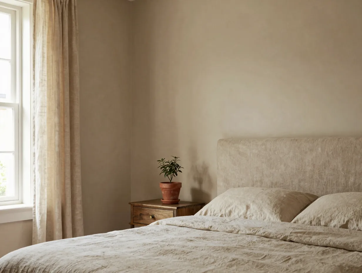
Warm, nature-led palettes are the dominant bedroom wall trend of 2026. Experts consistently highlight soft earthy neutrals, warm beige, sandy taupe, clay-toned beiges, soft caramels, and chalky stone, as the foundation for a dreamy, restorative retreat [9][13]. These shades are recommended specifically because they make bedrooms feel “cocooning” and are exceptionally easy to live with across different lighting conditions.
Why it works: Earthy neutrals reflect warm light rather than absorbing it, which means the room feels softer in the morning and warmer by lamplight in the evening. They also pair effortlessly with almost every wood tone, textile, and metal finish.
Best pairings:
- Warm beige walls with aged brass hardware and linen bedding
- Sandy taupe with natural rattan and warm white trim
- Chalky stone with deep walnut furniture and terracotta accents
Top paint picks for 2026: Look for shades described as “greige” (gray-beige hybrids) that lean warm rather than cool. The key is to hold your sample card next to a warm white, if the neutral looks slightly yellow or pink, it is warm; if it looks lavender or blue, it will read cold at night.
2. Color-Drenching: One Hue, Every Surface
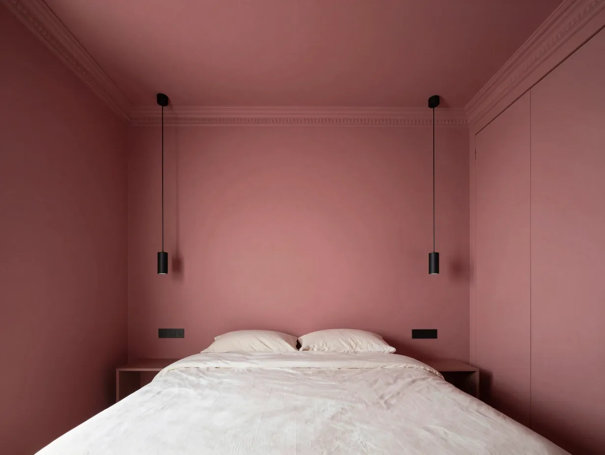
Color-drenching is the technique that interior designers are most excited about in 2026, and it is easier to execute than it sounds. The idea is simple: paint the walls, ceiling, trim, and even built-in furniture in a single rich hue or closely related tonal family. The result is an enveloping, womb-like space that feels deeply intentional [5][8].
“Color-drenching removes visual noise. When every surface is the same tone, the eye has nowhere to bounce, and the room becomes genuinely restful.”, paraphrased from editorial coverage of 2026 bedroom trends [8]
Recommended colors for color-drenching:
- Deep sage green
- Dusty plum
- Warm charcoal
- Muted clay pink
- Chocolate brown
Experts advise pairing deep burgundy, chocolate, or aubergine walls with similarly dark woods and creamy (not bright white) trim to reduce visual noise and heighten the cozy, dream-like atmosphere [5][11]. The trick is to avoid stark white trim, it breaks the immersive effect immediately.
How to start: Choose a mid-depth color rather than the darkest shade in the range. Paint a large sample (at least 60 cm x 60 cm) on multiple walls and observe it at different times of day before committing.
3. The Headboard Accent Wall: Jewel Tones That Anchor the Room
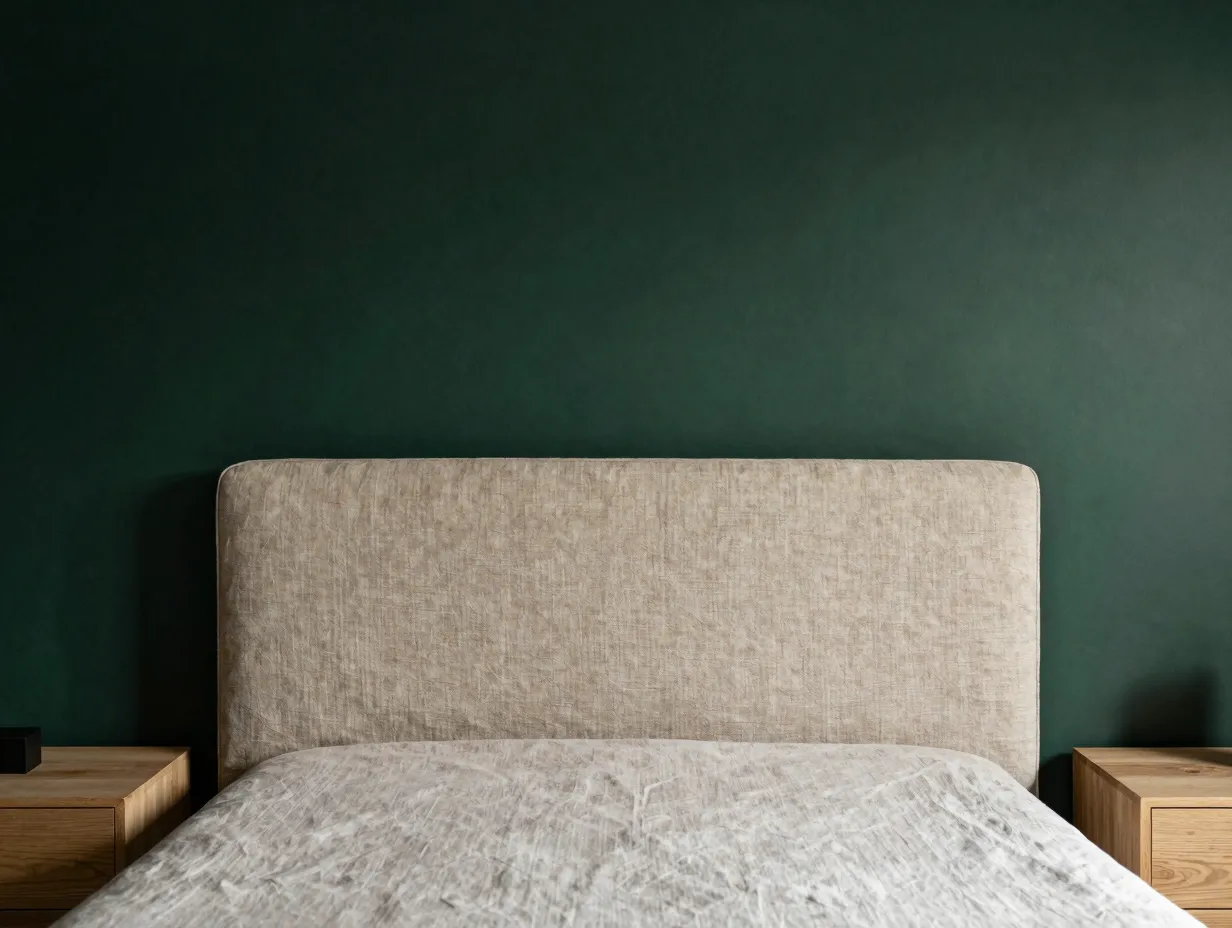
The accent wall never really went away, but it has been dramatically upgraded for 2026. The return of the accent wall, specifically behind the headboard, is one of the most cited bedroom design moves of the year, particularly when executed in deep jewel tones such as navy, emerald green, sapphire, or rich burgundy [8][9].
What separates a dated accent wall from a sophisticated one comes down to three factors:
| Factor | Dated Version | 2026 Version |
|---|---|---|
| Color | Bright red or orange | Deep navy, emerald, or plum |
| Finish | Satin or semi-gloss | Matte or eggshell |
| Edge treatment | Hard painted line | Architectural detail (paneling, plaster molding) |
My recommendation: If you are nervous about committing to a full dark wall, start with the headboard wall only. A single wall in deep forest green behind a natural linen headboard is one of the most transformative, low-risk moves in bedroom design. It costs less than a new duvet cover and has ten times the visual impact.
4. Limewash and Textured Plaster Finishes: Walls That Breathe
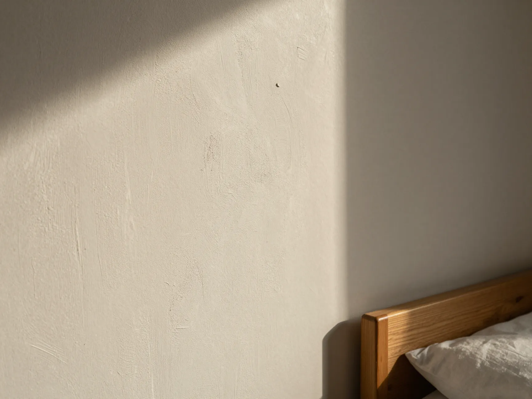
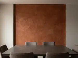
Flat paint is fine, but textured wall finishes are in a different league when it comes to creating a dreamy, atmospheric bedroom. Limewash, Venetian plaster, and modern clay-based paints add depth and organic variation that no flat coat can replicate [3][7].
Limewash creates a soft, cloudy, layered effect that looks like aged Italian plaster. It absorbs and reflects light differently across the day, meaning your bedroom wall literally changes mood from morning to evening.
Venetian plaster is more polished and reflective, with a subtle sheen that catches light without being glossy. It suits bedrooms that lean toward the luxurious or boutique-hotel aesthetic [3].
Clay-based paints are the most accessible entry point. Brands now offer clay paints in ready-to-use formulas that any competent DIYer can apply. They produce a soft, chalky, matte finish with a slight texture that photographs beautifully and feels warm to the touch.
Application tip: All three finishes reward imperfection. Do not try to achieve a perfectly uniform coat. The variation is the point.
5. Earthy Greens: Sage, Botanical, and Blue-Green Hues
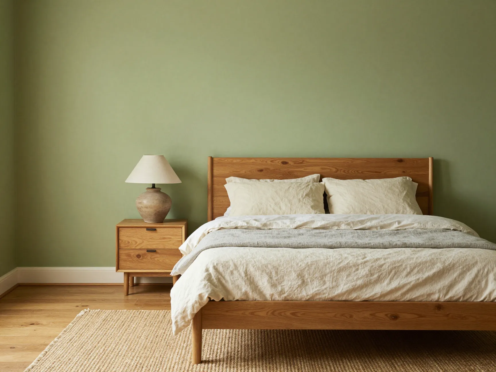
If there is one color family that has earned the title of “bedroom color of 2026,” it is earthy green. Multiple trend roundups identify sage, botanical greens, and blue-greens with warm undertones as headline bedroom colors, noting that these hues are frequently specified for sanctuary-style spaces [10][11]. Valspar named “Sage Slate” as a key color for 2026, and broader “transformative teal” themes have appeared across multiple paint brand forecasts.
Why green works so well in bedrooms:
- Green sits in the middle of the visible light spectrum, requiring the least visual adjustment from the eye
- Warm-toned greens (those with yellow or brown undertones) feel grounding rather than clinical
- Green connects subconsciously to nature, which research consistently links to lower stress levels
The spectrum to explore:
- Pale sage: soft, almost neutral, works in small bedrooms
- Mid sage: the sweet spot for most spaces, pairs with natural wood and linen
- Deep olive: dramatic and grounding, best in larger rooms with good natural light
- Blue-green (teal/mineral): adds a cooler, more sophisticated edge while retaining warmth
6. Cocoon Sanctuary: Deep, Saturated, and Fully Immersive
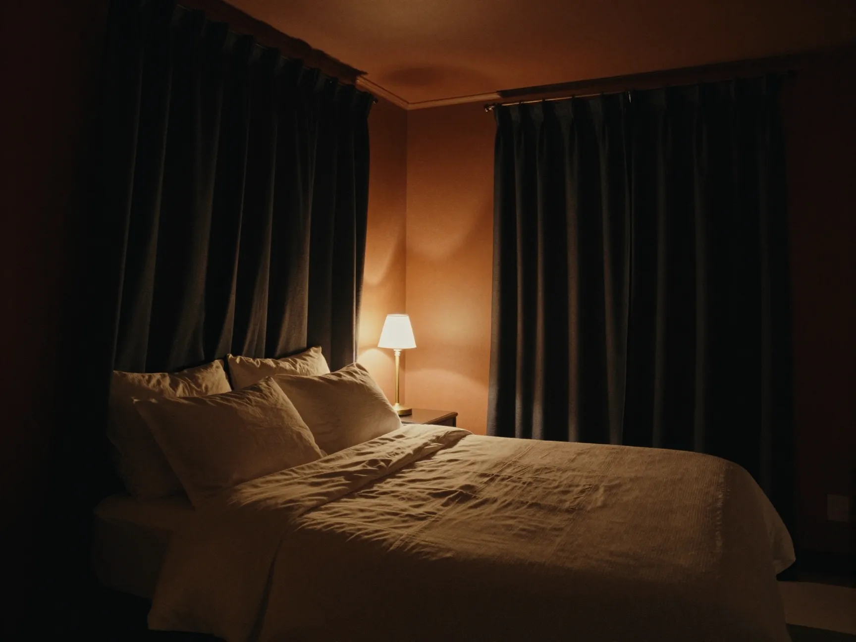
The “cocoon sanctuary” is a full design concept, not just a paint choice. It combines saturated wall colors, color-drenching across walls and ceilings, blackout window treatments, and warm, dim lighting to create a deeply enveloping retreat [5][8][9]. Think of it as the bedroom equivalent of a luxury spa treatment room.
Recommended wall colors for the cocoon sanctuary look:
- Deep charcoal with warm undertones (not cool blue-gray)
- Muted plum or dusty aubergine
- Rich clay pink
- Deep sage or forest green
- Warm chocolate brown
The ceiling is critical in this approach. Painting the ceiling in the same color as the walls, or one shade darker, lowers the perceived ceiling height and makes the room feel more enclosed and intimate. Combined with warm-toned bulbs (2700K or lower) and layered textile softness, the result is a bedroom that feels genuinely separate from the outside world.
One practical note: Deep, saturated colors require more primer coats and may need a tinted primer to achieve full coverage. Budget for two to three finish coats when working with very dark shades.
7. Japandi and Minimalist Tonal Layering

Japandi, the hybrid of Japanese and Scandinavian design philosophies, continues to influence bedroom aesthetics in 2026, particularly in how it approaches wall color. Rather than a single bold statement, Japandi bedrooms use subtle tonal layering: walls, trim, and ceiling in closely related warm neutrals, with the variation coming from texture and material rather than color contrast [7][9].
The Japandi palette for bedroom walls:
- Warm off-white (not stark white)
- Soft warm gray with beige undertones
- Pale warm sand
- Very light warm taupe
What makes it work: The restraint. Every element in a Japandi bedroom earns its place. The wall color is deliberately quiet so that the quality of materials, a handmade ceramic lamp, a linen duvet, a solid oak bed frame, can speak clearly.
For renters: This is the most renter-friendly approach on this list. A warm off-white or pale sand is easy to paint over when you leave, unlikely to cause landlord issues, and still dramatically more restful than a cold, builder-grade white.
Styling tip: Layer textures rather than colors. A chunky knit throw, a woven jute rug, and a rough linen pillowcase against a warm off-white wall creates more visual interest than three different paint colors ever could.
8. Warm Terracotta and Clay Tones: The Boldest Earthy Statement
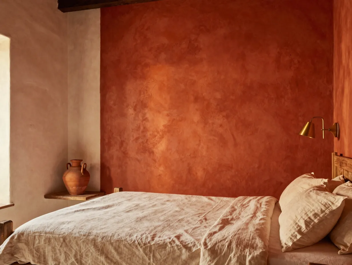
Terracotta and clay-toned walls are the boldest entry in this guide to 8 Bedroom Wall Designs and Paint Ideas for a Dreamy Retreat, and they reward courage. These warm, red-earth hues have roots in Mediterranean, Southwestern, and African design traditions, and they bring an immediate sense of warmth, history, and groundedness to any bedroom [6][10].
The range within terracotta:
- Pale blush clay: almost a warm pink, soft and feminine
- True terracotta: the classic fired-earth orange-red
- Deep burnt sienna: richer and more dramatic, closer to a warm brown
- Dusty rose-clay: a muted, sophisticated version that reads as a warm neutral in low light
How to use it without overwhelming the room:
- Pair terracotta walls with natural materials, linen, jute, raw wood, and unglazed ceramics, to keep the palette grounded.
- Avoid pairing with cool metals like chrome or brushed nickel; warm brass and matte black work far better.
- Use white or cream bedding to provide visual relief without introducing a jarring contrast.
- In smaller rooms, consider terracotta on one wall only (the headboard wall) rather than all four.
A personal note: I used a dusty clay tone in a guest bedroom last year, and every single person who has stayed there has commented on how well they slept. It is the warmest, most enveloping room in the house, and it cost less than $80 in paint to achieve.
How to Choose the Right Design for Your Bedroom
With so many strong options in this guide to 8 Bedroom Wall Designs and Paint Ideas for a Dreamy Retreat, the decision can feel overwhelming. Here is a simple framework to narrow it down:
Step 1: Assess your light. North-facing rooms need warm colors (earthy beiges, warm greens, terracotta) to compensate for cool natural light. South-facing rooms can handle cooler or deeper tones because they receive plenty of warm afternoon light.
Step 2: Consider your room size. Smaller rooms benefit from tonal approaches (Japandi layering, warm neutrals) or color-drenching in mid-depth tones. Larger rooms can absorb bold jewel tones and deep cocoon colors without feeling oppressive.
Step 3: Match your existing furniture. Warm wood tones (oak, walnut, teak) pair with virtually every earthy palette. Cool-toned furniture (white lacquer, gray upholstery) will fight against terracotta and deep warm greens.
Step 4: Test before you commit. Paint at least two large samples on different walls. Observe them morning, afternoon, evening, and under artificial light. The color you choose at the paint store under fluorescent lighting will look completely different at 9 p.m. under a warm bedside lamp.
Common Mistakes to Avoid
Even with the best intentions, bedroom wall projects go wrong. Here are the most frequent errors and how to sidestep them:
- Choosing too cool a neutral. A gray that looks warm in the store will often read lavender or blue at home. Always test against a warm white reference card.
- Skipping primer. Dark colors over light walls, or light colors over dark ones, require a quality primer. Skipping this step leads to uneven coverage and color bleed.
- Using the wrong finish. Satin and semi-gloss finishes reflect light in ways that amplify every wall imperfection. For bedrooms, matte or eggshell is almost always the right choice.
- Ignoring the ceiling. A brilliant white ceiling above a warm, deep wall creates a jarring contrast that undermines the cocooning effect. Tint the ceiling slightly toward your wall color for a more cohesive result [5].
- Rushing the drying time. Most paints need 24 hours between coats and 30 days to fully cure. Judging your color before it has cured can lead to premature regret.
Conclusion
The eight ideas in this guide, from warm earthy neutrals and color-drenching to limewash textures and bold terracotta statements, represent the full spectrum of what is possible when you treat your bedroom walls as the most important design decision in the room. And based on everything the research tells us about how color affects sleep, mood, and stress, that is exactly what they are [6][9].
Your actionable next steps:
- Identify your room’s light direction (north, south, east, or west facing) before choosing any color.
- Pick two or three ideas from this list that resonate with your existing furniture and personal style.
- Order sample pots, never commit to a full gallon without testing on your actual walls.
- Observe your samples at different times of day, including under your bedside lamp at night.
- Once you have chosen your color, invest in quality primer and matte or eggshell finish paint for the best result.
Your bedroom should be the most restorative room in your home. The right wall color is not a luxury, it is the foundation everything else is built on. Start with one wall, one color, and one weekend. The transformation will surprise you.
References
[1] Bedroom Wall Painting – https://www.homelane.com/design-ideas/bedroom-design/bedroom-wall-painting/
[3] Modern Decorative Wall Paint Ideas For Bedrooms In 2026 – https://venetianplastershop.ca/modern-decorative-wall-paint-ideas-for-bedrooms-in-2026/
[4] Wall Painting Designs For Bedroom – https://www.nobroker.in/painting-services/home-painting-ideas/wall-painting-designs-for-bedroom/
[5] ideal.house – https://ideal.house/community/news/179853
[6] Bedroom Paint Colors Out 2026 – https://www.goodhousekeeping.com/home/decorating-ideas/a70929118/bedroom-paint-colors-out-2026/
[7] Wall Paint Designs – https://www.livspace.com/in/design-ideas/wall-paint-designs
[8] Interior Designers Predict 7 Bedroom Trends – https://shopping.yahoo.com/home-garden/home-decor/articles/interior-designers-predict-7-bedroom-140000607.html
[9] Bedroom Trends 2026 – https://www.homesandgardens.com/interior-design/bedrooms/bedroom-trends-2026
[10] Trending Bedroom Colours For 2026 What Interior Designers Wont Tell You – https://www.noragouma.com/trending-bedroom-colours-for-2026-what-interior-designers-wont-tell-you/